Geovisualization, Inequality and Space - Maps
The following maps were produced by Benjamin Hennig (www.viewsoftheworld.net), further explanation in Dorling and Lee (2016) Geography, London: Profile.
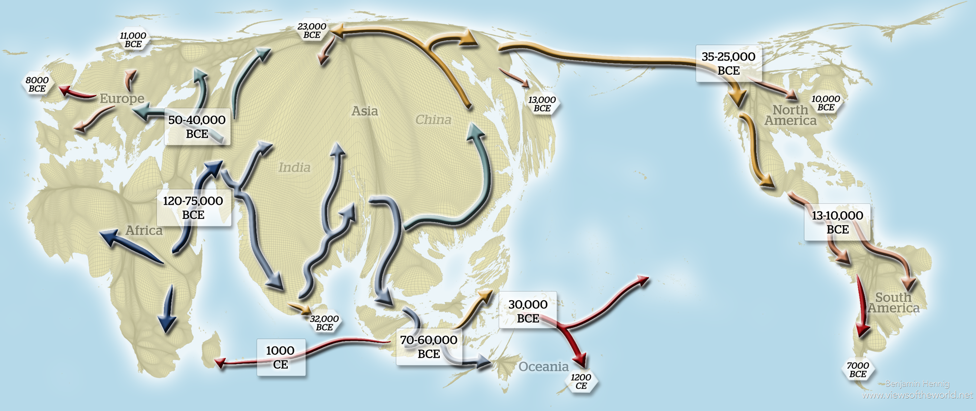 |
Map 1: Humankind's migrationThis map shows the migration of humanity across the world based on what we currently know from mitochondrial DNA tracking. The map also shows approximate dates for arrival and dispersal in key locations. The underlying projection shows the relative population density on Earth today, resizing the land area based on the number of people living in each space. |
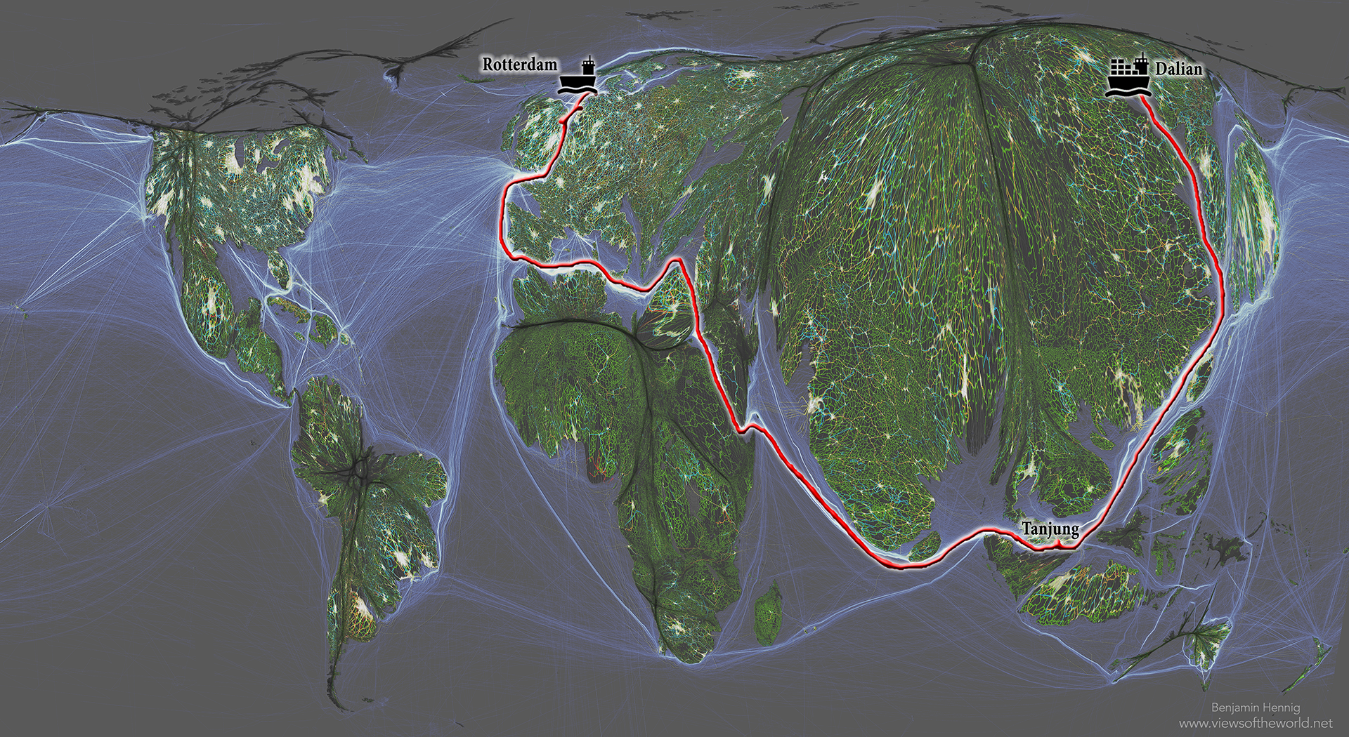 |
Map 2: Global connectivityThis map is a picture of the maiden voyage of MSC Oscar, which is the world's largest container ship: it went from Dalian, China to Rotterdam, Netherlands and is shown here in the context of the most frequent global shipping routes that can be seen in the background shown on an equal-population projection of the world. The projection shows the relative population density on Earth, resizing the land area based on the number of people living in each space. |
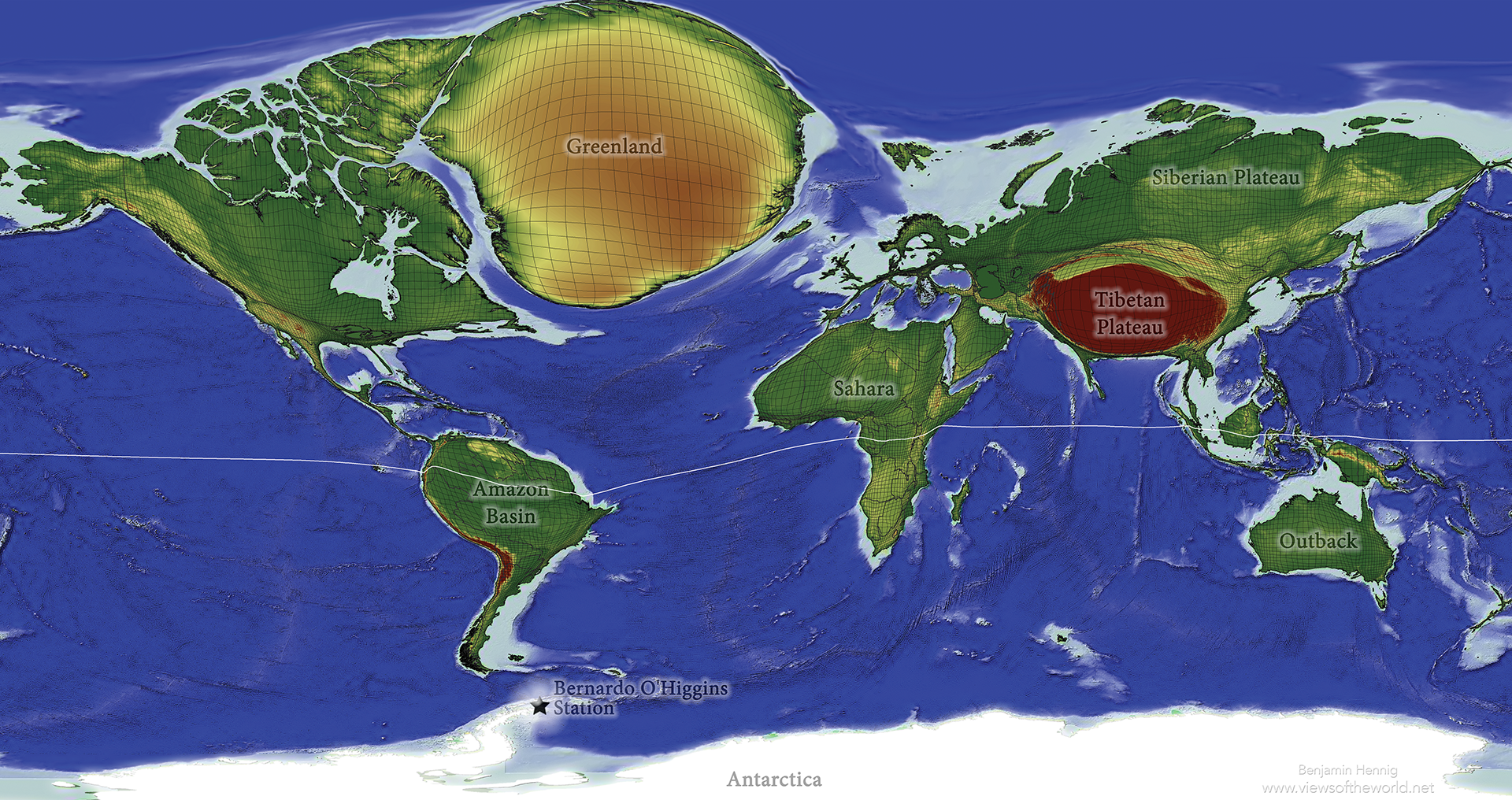 |
Map 3: World's remotest placesThis map shows the most remote places on the planet, the spaces where a 'lonely planet' can still be found. It shows areas larger, the further it takes to get to them via land travel from the nearest large city. |
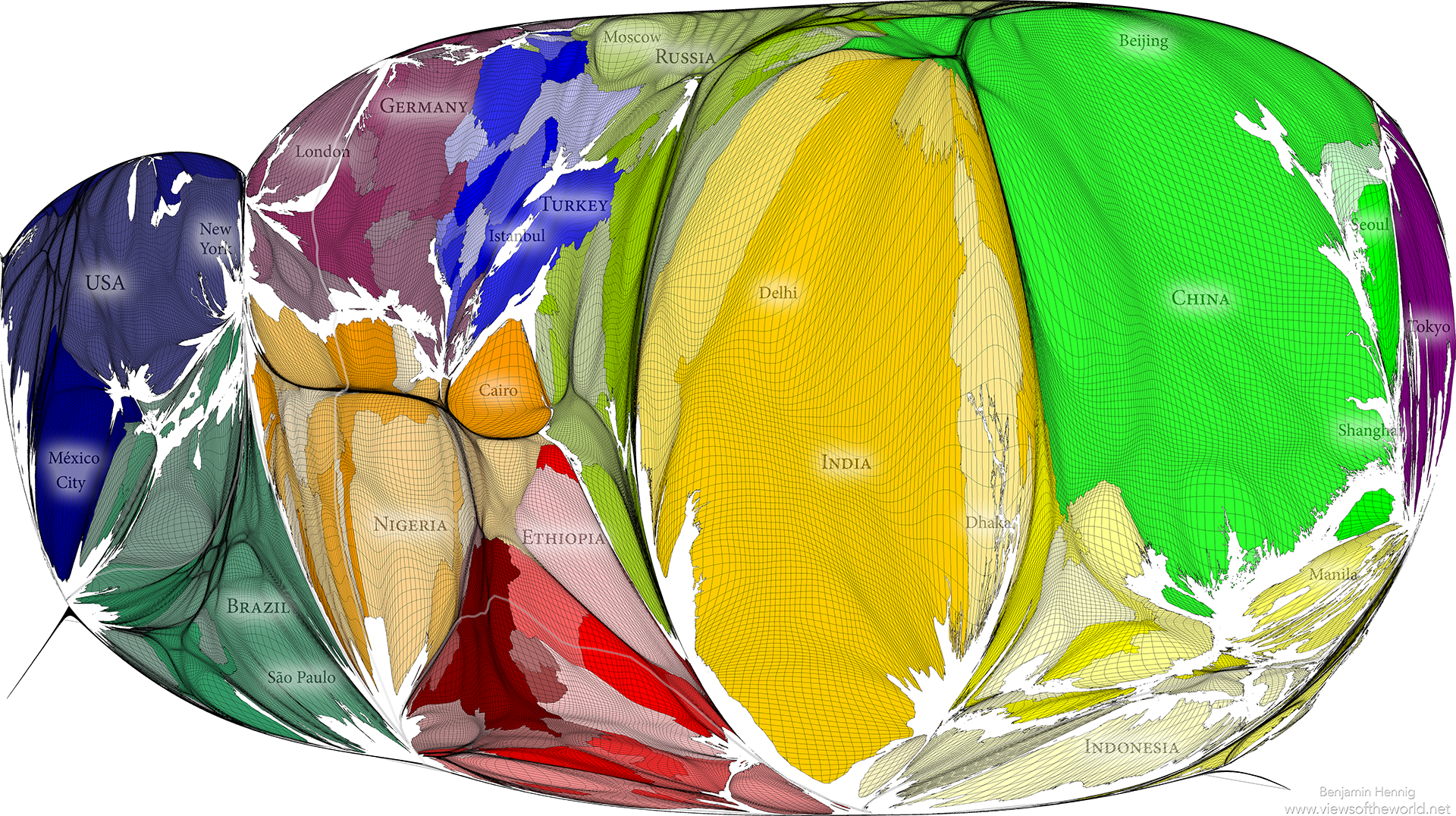 |
Map 4: A modern mappa mundiThis is a 'mappa mundi' of the modern world: in the map every small area is drawn in proportion to the population that lives there. Oceans are reduced in size to a minimum leaving almost no space between the continents. It shows today's centre of the human planet to lie in India. |
 |
Map 5: Global croplandsFeeding a global population of 10 billion is one of the great challenges of the 21st century. This map is drawn to show where the most productive croplands are by increasing the size of those areas that are currently used for farming agricultural produce, while omitting those areas that are less suitable for agriculture or used for other purposes. |
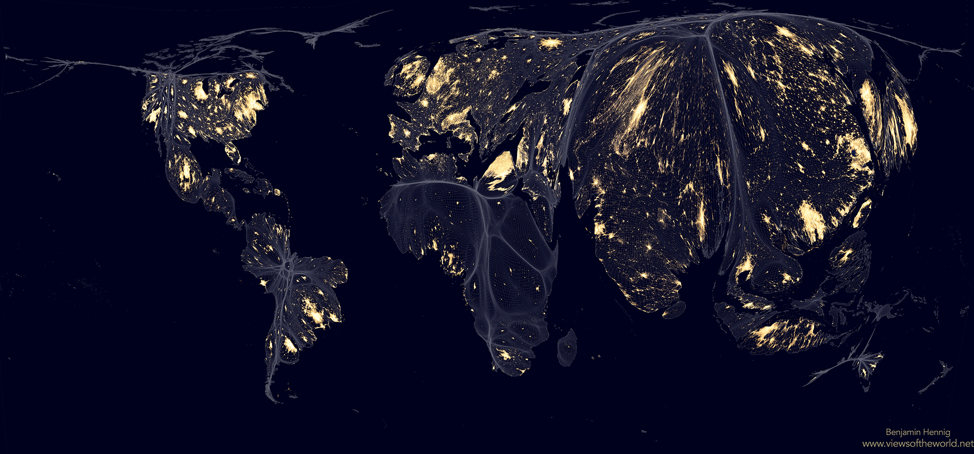 |
Map 6: Earth at nightThis shows Earth at night on a population density map. Instead of highlighting the geographical land areas that are shining brightest at night, this map highlights where people live with and without light. The projection shows the relative population density in the world, resizing the land area based on the number of people living in each space. |
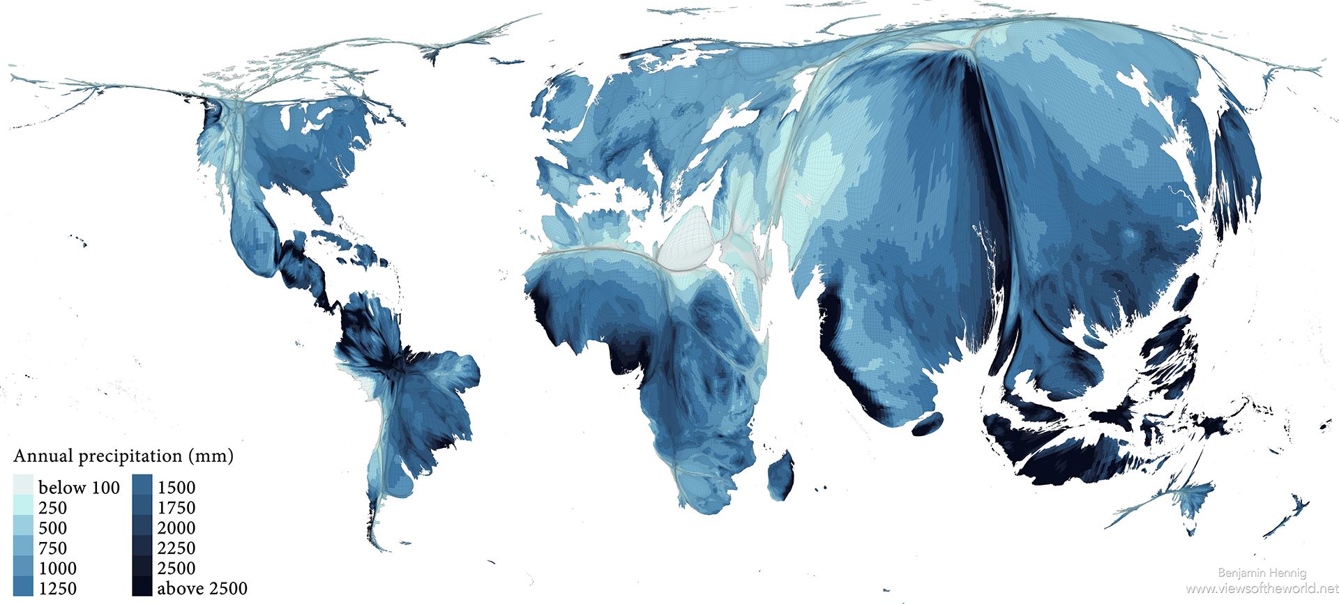 |
Map 7: Global precipitation patternsThis map shows the annual precipitation mapped onto a population distribution map. The underlying projection shows the relative population density on Earth today, resizing the land area based on the number of people living in each space. |